Look at the phone in your hand right now. How are you holding it?
If you are like most people, you are probably holding it with one hand, resting the bottom of the phone on your pinky finger. Your thumb is doing all the work on the screen.
For years, web designers (myself included) have put the main menu at the very top of the mobile screen. Usually, it’s hidden behind that little “hamburger” icon (the three stacked lines). It’s the standard way of doing things.
But I believe standards need to change when they no longer make sense.
I’ve come to a conclusion that changes how I design mobile websites: Mobile menus belong at the bottom of the screen, not the top.
Here is why.
The Problem: The “Thumb Stretch”
Remember the first iPhones? They were small. Your thumb could easily reach every corner of the screen.
Today, smartphones are huge. They are practically tablets. While screens have gotten bigger, our hands have stayed the same size.
When we place the menu icon at the top-right or top-left corner of these giant screens, we force users to perform awkward “thumb gymnastics.” You have to shift your grip, stretch your thumb uncomfortable, or use your second hand just to navigate to a different page.
It’s not a good user experience. It’s just an old habit we haven’t broken yet.
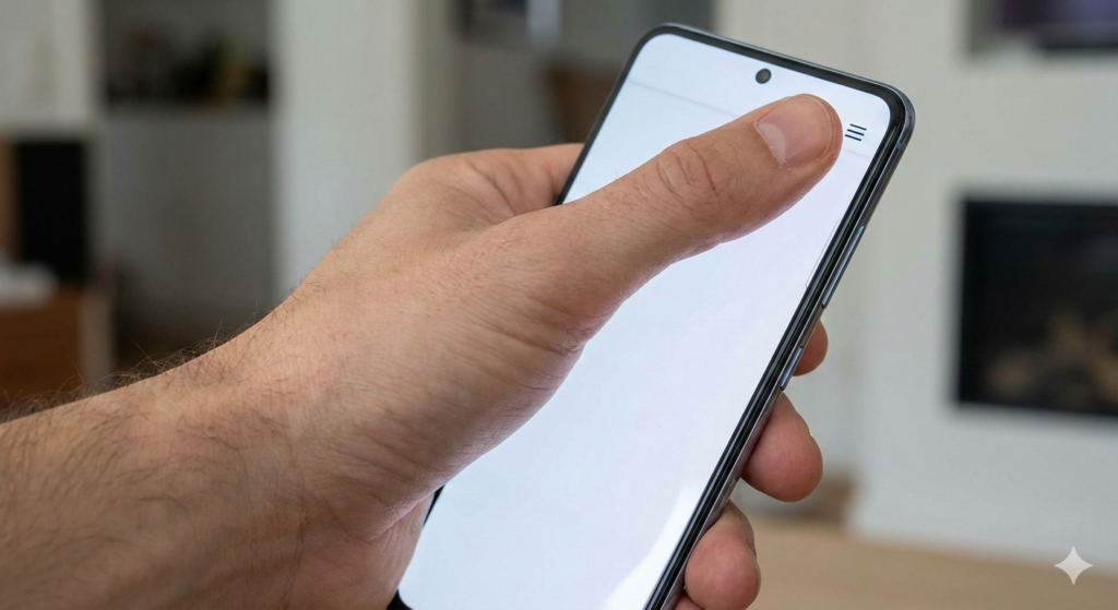
Stretching to reach the top corner isn’t comfortable on modern screens.
The Solution: The “Thumb Zone”
The idea of moving navigation to the bottom isn’t new, but web designers have been slow to adopt it.
There is a concept in UX design often called the “Thumb Zone.” It maps out the areas of a phone screen that are easy, okay, or hard to reach with one hand.
The bottom third of the screen is the “easy zone.” It is natural territory for your thumb. You don’t have to stretch; you just tap.
If we want our websites to be easy to use, why put the most important elements—the navigation links—in the hardest-to-reach area?
By moving the menu to the bottom, we put control right under the user’s thumb. It feels faster, easier, and much more comfortable.
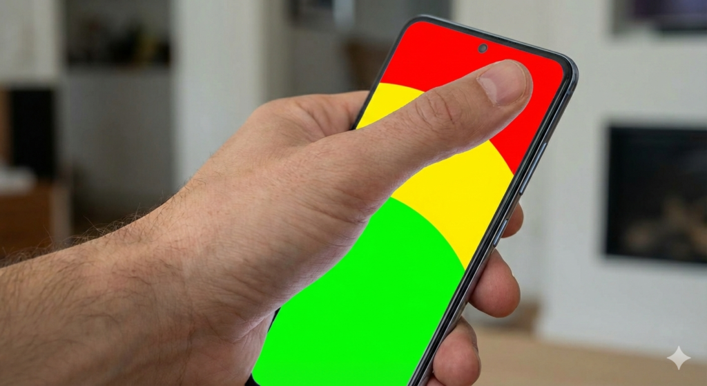
The “Thumb Zone” shows us that the bottom of the screen is the most natural place for interaction.
Apps Already Know This
If you look at your favorite native apps, you’ll see they already understand this.
Look at Instagram, Spotify, X (Twitter), or LinkedIn. Where is their main navigation? It’s a bar parked at the bottom of the screen. They know that for daily, repetitive tasks like switching tabs, bottom navigation is superior.
Mobile websites should learn from mobile apps. Users expect that level of comfort now. When a user lands on a mobile website and finds the menu at the bottom, it feels modern and intuitive.
Here is an example of how I implement this concept in my designs. Instead of a top bar, I use a clean, accessible bottom navigation bar for the main links.
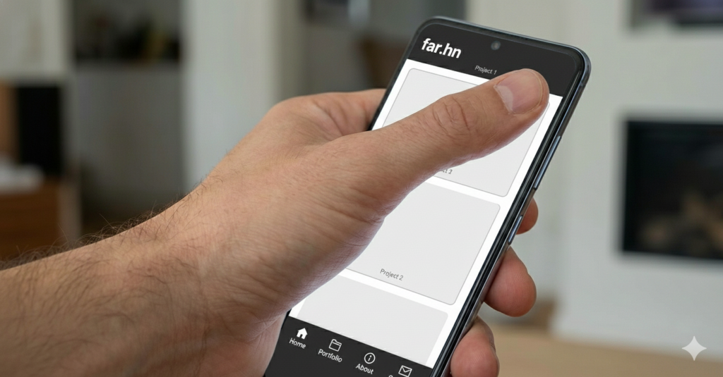
Navigation placed comfortably in the thumb zone.
Conclusion: Designing for Humans
As designers, our job isn’t just to make things look pretty. Our job is to make things easy for humans to use.
Sticking to the old “top-right hamburger menu” on mobile is ignoring the reality of how people actually hold and use their large phones today.
It’s a small change, moving a bar from top to bottom, but it makes a massive difference in how natural a website feels. It’s time to save our thumbs the stretch.